 There is an old saying, “You don’t get a 2nd chance to make a 1st impression”. Sure it’s cliché, but oftentimes the first impression a potential new customer of an independent pharmacy (or any locally owned business) is the signage above the front door. I’ve collected countless numbers of business cards at tradeshows where an independent pharmacy uses their store name alongside an old image of a classic mortar & pestle. While we all know this symbolizes the very root of pharmacy and quickly identifies with the public as a place to pick up prescriptions, your image could be perceived as a bit outdated with today’s customers, especially the Millennial generation.
To better illustrate this concept, let me put this analogy another way that doesn’t hit so closely to home…
If you were shopping for a new wireless phone provider/carrier and you saw a storefront that used the old hand crank rotary phone as their logo, what feelings or emotions would you have toward that prospective merchant? Do you think you would you give them a shot or drive to the next competitor? Now do you see why an outdated store front/ sign may make younger shoppers feel that your place of business may not have the latest and greatest resources and technologies? Customers have more buying power than ever right now and realize that they have many choices when it comes to picking their pharmacy, don’t give them the wrong impression.
You’ve stayed up to date with cutting edge technologies and innovative automation to deliver personalized health & wellness, but does that matter if your community perceives your store as outdated because of the state of your store front? Consider updating your logo with new, healthy fonts and if you are interested in learning some color schemes associated with health & wellness, check this article out about the psychology of color. You will also get some great ideas by simply Googling “modern pharmacy logos”.
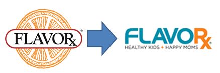
FLAVORx is no exception and we try to practice what we preach. In the last year our company went through our own rebranding and updated our logo, font, and messaging. When we first began our tagline was “We make medicine time a lot less yucky”, but a lot had changed since we began our company in 1997. Medicine was no longer considered yucky and many times it came already flavored.
With the economy evolving FLAVORx as a company realized that we are not just a commodity or good, but we are a solution to a problem, a service or experience. By repositioning our story and sharing how we align with the priorities of today’s customer we can slowly change how pharmacies (our customers) see us.
Changing can be hard but if you plan on being in business for the next few years, you need to think about how your business appeals to the up and coming generation. By changing a few things, like your logo, you will not lose customers but you definitely can gain some more.


